
HTML+CSS 实现环绕倒影加载特效:从零到完整的代码解析
效果预览
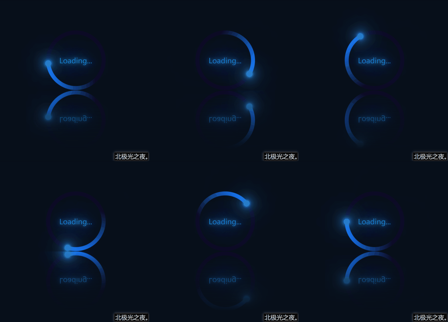
本文介绍如何使用 HTML 和 CSS 实现一个带有倒影效果的环绕加载动画。最终效果为一个蓝色渐变圆环围绕中心旋转,并伴有发光小球和倒影,整体视觉简洁且富有动感。
实现步骤
下面逐步讲解实现过程,建议边看边编写代码,便于理解每个部分的作用。
1. 基础初始化
首先进行全局样式重置,并设置页面主体为 Flex 布局,使子元素在水平和垂直方向居中。
* {
  margin: 0;
  padding: 0;
  box-sizing: border-box;
}
body {
  height: 100vh;
  display: flex;
  justify-content: center;
  align-items: center;
  background-color: rgb(7, 15, 26);
}
2. 定义 HTML 结构
使用三层嵌套结构:最外层容器 .container,包含文本 Loading... 和圆形盒子 .circle,圆形盒子内部再放置一个 .ring 元素作为蓝色圆环。
<div>
  <span>Loading...</span>
  <div>
    <div></div>
  </div>
</div>
3. 容器样式与倒影效果
为 .container 设置相对定位和固定尺寸,并利用 -webkit-box-reflect 属性实现倒影效果,倒影位置在下方 1px 处,并带有渐变遮罩。
.container {
  position: relative;
  height: 150px;
  width: 250px;
  -webkit-box-reflect: below 1px linear-gradient(transparent, rgb(7, 15, 26));
}
4. 圆形盒子与旋转动画
.circle 作为底层圆形,设置背景色、圆角,并添加旋转动画。动画通过 @keyframes 定义,从 0 度旋转到 360 度,持续 2 秒,线性无限循环。
.circle {
  position: relative;
  margin: 0 auto;
  height: 150px;
  width: 150px;
  background-color: rgb(13, 10, 37);
  border-radius: 50%;
  animation: zhuan 2s linear infinite;
}
@keyframes zhuan {
  0% { transform: rotate(0deg); }
  100% { transform: rotate(360deg); }
}
5. 使用伪类覆盖中心区域
通过 .circle::after 伪元素创建一个与背景色相同的小圆,覆盖在圆形中心,形成环形视觉基础。
.circle::after {
  content: '';
  position: absolute;
  top: 10px;
  left: 10px;
  right: 10px;
  bottom: 10px;
  background-color: rgb(7, 15, 26);
  border-radius: 50%;
}
6. 蓝色渐变圆环
.ring 元素为半圆形状,使用线性渐变从蓝色过渡到透明,配合圆角形成左侧半环效果。
.ring {
  position: absolute;
  top: 0;
  left: 0;
  width: 75px;
  height: 150px;
  background-image: linear-gradient(180deg, rgb(22, 121, 252), transparent 80%);
  border-radius: 75px 0 0 75px;
}
7. 发光小球点缀
通过 .ring::after 伪元素在圆环末端添加一个发光的小球,利用多重 box-shadow 实现光晕效果,并设置 z-index 确保其显示在最上层。
.ring::after {
  content: '';
  position: absolute;
  right: -5px;
  top: -2.5px;
  width: 15px;
  height: 15px;
  background-color: rgb(40, 124, 202);
  box-shadow: 0 0 5px rgb(40, 151, 202),
              0 0 10px rgb(40, 124, 202),
              0 0 20px rgb(40, 124, 202),
              0 0 30px rgb(40, 124, 202),
              0 0 40px rgb(40, 124, 202),
              0 0 50px rgb(40, 124, 202),
              0 0 60px rgb(40, 124, 202),
              0 0 60px rgb(40, 124, 202);
  border-radius: 50%;
  z-index: 1;
}
8. 文本样式
为 Loading... 文本设置绝对定位居中,并添加蓝色文字阴影,使其具有发光效果。
.container > span {
  position: absolute;
  left: 50%;
  top: 50%;
  transform: translate(-50%, -50%);
  color: rgb(20, 129, 202);
  text-shadow: 0 0 10px rgb(20, 129, 202),
               0 0 30px rgb(20, 129, 202),
               0 0 60px rgb(20, 129, 202),
               0 0 100px rgb(20, 129, 202);
  font-size: 18px;
  z-index: 1;
}
完整代码
将上述所有部分整合,即可得到完整的可运行 HTML 文件。
<!DOCTYPE html>
<html lang="zh-CN">
<head>
  <meta charset="UTF-8">
  <meta http-equiv="X-UA-Compatible" content="IE=edge">
  <meta name="viewport" content="width=device-width, initial-scale=1.0">
  <title>环绕倒影加载特效</title>
  <style>
    * {
      margin: 0;
      padding: 0;
      box-sizing: border-box;
    }
    body {
      height: 100vh;
      display: flex;
      justify-content: center;
      align-items: center;
      background-color: rgb(7, 15, 26);
    }
    .container {
      position: relative;
      height: 150px;
      width: 250px;
      -webkit-box-reflect: below 1px linear-gradient(transparent, rgb(7, 15, 26));
    }
    .container > span {
      position: absolute;
      left: 50%;
      top: 50%;
      transform: translate(-50%, -50%);
      color: rgb(20, 129, 202);
      text-shadow: 0 0 10px rgb(20, 129, 202),
                   0 0 30px rgb(20, 129, 202),
                   0 0 60px rgb(20, 129, 202),
                   0 0 100px rgb(20, 129, 202);
      font-size: 18px;
      z-index: 1;
    }
    .circle {
      position: relative;
      margin: 0 auto;
      height: 150px;
      width: 150px;
      background-color: rgb(13, 10, 37);
      border-radius: 50%;
      animation: zhuan 2s linear infinite;
    }
    @keyframes zhuan {
      0% { transform: rotate(0deg); }
      100% { transform: rotate(360deg); }
    }
    .circle::after {
      content: '';
      position: absolute;
      top: 10px;
      left: 10px;
      right: 10px;
      bottom: 10px;
      background-color: rgb(7, 15, 26);
      border-radius: 50%;
    }
    .ring {
      position: absolute;
      top: 0;
      left: 0;
      width: 75px;
      height: 150px;
      background-image: linear-gradient(180deg, rgb(22, 121, 252), transparent 80%);
      border-radius: 75px 0 0 75px;
    }
    .ring::after {
      content: '';
      position: absolute;
      right: -5px;
      top: -2.5px;
      width: 15px;
      height: 15px;
      background-color: rgb(40, 124, 202);
      box-shadow: 0 0 5px rgb(40, 151, 202),
                   0 0 10px rgb(40, 124, 202),
                   0 0 20px rgb(40, 124, 202),
                   0 0 30px rgb(40, 124, 202),
                   0 0 40px rgb(40, 124, 202),
                   0 0 50px rgb(40, 124, 202),
                   0 0 60px rgb(40, 124, 202),
                   0 0 60px rgb(40, 124, 202);
      border-radius: 50%;
      z-index: 1;
    }
  </style>
</head>
<body>
  <div>
    <span>Loading...</span>
    <div>
      <div></div>
    </div>
  </div>
</body>
</html>
总结
通过以上步骤,我们利用 HTML 和 CSS 实现了一个具有倒影效果的环绕加载动画。核心点包括:使用 -webkit-box-reflect 实现倒影,利用伪元素和渐变构建环形,通过 box-shadow 和 text-shadow 增加发光效果,以及使用 @keyframes 实现旋转动画。该效果可应用于页面加载提示,提升视觉体验。
原文链接:本站整理
本文来自互联网用户投稿,该文章观点仅代表作者本人,不代表本站立场。本站仅提供信息存储空间服务,不拥有所有权,不承担相关法律责任。
如若内容造成侵权/违法违规/事实不符,请将相关资料发送至 service@2cto.cc 进行投诉反馈,一经查实,立即处理!
您可能感兴趣的文章:
下一篇:HTML中使用Flex布局实现双行夹批效果的方法详解